Some colours sit together quietly; others spark. This lesson explains warm and cool colours and the six harmonies that tailors and stylists use to build an outfit around a trouser, with Indian pairings that have worked for centuries.

What you’ll learn
- Which colours are warm, which are cool, and why the line is blurry.
- The six harmonies: one colour, neighbours, opposites, split opposites, triad, and neutrals plus an accent.
- Traditional Indian colour pairings and what they teach.
- A simple proportion rule for using several colours in one outfit.
Warm and cool
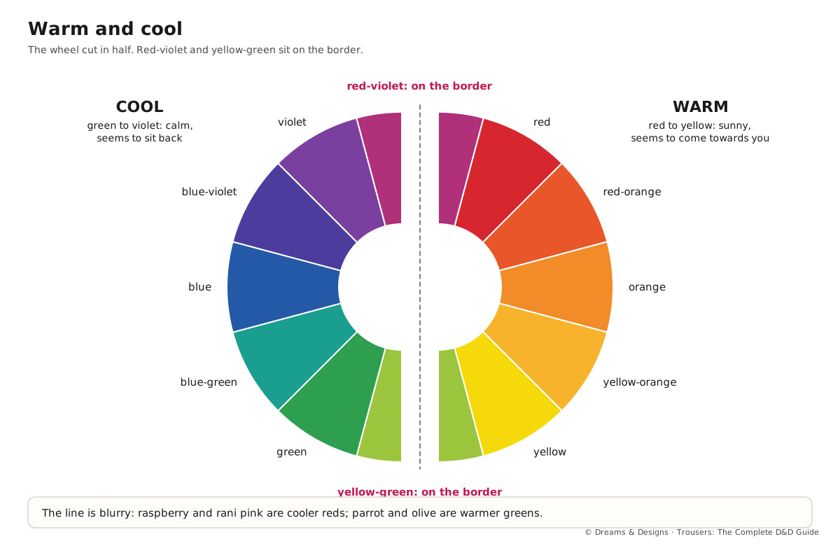
Cut the wheel in half. Warm colours run from red through orange to yellow: they feel sunny and lively, and seem to come towards you. Cool colours run from green through blue to violet: they feel calm and fresh, and seem to sit back.
The line is not sharp. Any hue can lean either way: a red with a touch of blue (raspberry, rani pink) is cooler than a red with a touch of yellow (tomato, coral). A green with yellow (parrot, olive) is warmer than a green with blue (emerald, teal). Neutrals lean too: camel, cream and chocolate are warm; grey, navy and pure white are cool.
Ebook practice holds that a trouser and top of the same temperature – both warm, or both cool – look planned, while mixing a warm neutral with a cool one can look accidental. Mixing temperatures on purpose is fine; it just needs to look deliberate.
The six harmonies
| Harmony | What it is | A trouser outfit |
|---|---|---|
| One colour (monochrome) | One hue in several values or saturations | Navy trouser, powder-blue shirt, indigo jacket |
| Neighbours (analogous) | Two or three hues side by side on the wheel | Mustard palazzo, rust kurta, haldi-yellow dupatta |
| Opposites (complementary) | Two hues across the wheel | Bottle-green churidar, maroon kurta |
| Split opposites | One hue plus the two beside its opposite | Teal trouser, coral top, gold juttis |
| Triad | Three hues evenly spaced | Child’s red trouser, yellow T-shirt, blue shoes |
| Neutrals plus an accent | Mostly neutrals, one strong colour | Charcoal trouser, white shirt, rani-pink stole |
Opposites are the loudest pairing: each makes the other look stronger. Soften them by changing value or saturation, so that one is dark and the other light, or one is strong and the other muted. Neighbours and one colour are the calmest, and the easiest place for a beginner to start.
Proportion of colours
A common styling guide, borrowed from interior design, is 60–30–10: about 60% of the outfit in a main colour, 30% in a second, and 10% in an accent. Trousers are usually part of the 60 or the 30. It is a starting point, not a law; many beautiful Indian outfits use a bold 50–50 split of two opposites.
In more depth: Indian colour pairings
Indian textiles have used bold harmonies for centuries. A few classic pairings, and what they teach:
- Body and contrast border (Kanjeevaram, Ilkal, Paithani): a saree body in one colour with a border or pallu in its opposite or a deep neighbour – green with rani pink, mustard with maroon, peacock blue with magenta. Translate it to trousers as a palazzo or dhoti pant with a contrast hem border.
- Ilkal’s red pallu (kempu, often with Kasuti): a dark body with a strong red end. On a trouser outfit, the red can move to the dupatta or a short jacket.
- Indigo and white (dabu and indigo block prints from Rajasthan, Kalamkari grounds): a one-colour harmony with white as the neutral. Perfect for summer cotton trousers.
- Red, black and white (Kutch embroidery, many tribal textiles): a high-contrast neutrals-plus-accent scheme.
- Kasavu off-white and gold (Kerala): neutrals with a metallic accent, worn by women and men.
- Maroon and gold: a dark warm hue with metallic, the classic festive pairing for sherwanis, dhoti pants and bridal wear.
Metallics – gold zari, silver, copper, antique gold – work as warm (gold, copper) or cool (silver) accents. Antique gold is softer than bright gold and sits more easily on daywear.
Step by step: build an outfit around a trouser
- Name the trouser’s colour by hue, value and saturation, and whether it leans warm or cool.
- Decide the mood: calm (one colour or neighbours), lively (opposites or triad), or quiet with a spark (neutrals plus accent).
- Pick the top colour from that harmony. Hold the two cloths together in daylight.
- Add the layer or dupatta as the third colour, or as a deeper value of one already used.
- Choose shoes and bag to repeat one colour, or to stay neutral.
- Check the 60–30–10 balance by squinting.
- Photograph it; the photo shows clashes the mirror misses.
Tips, tricks and hacks
- Repeat once: any colour that appears only once can look stray. Repeat the accent in a small second place (bag, embroidery, footwear).
- Prints give you the palette: pick the trouser colour from a small colour in the kurta print.
- Soft opposites: sage with dusty rose, or navy with rust, gives the energy of opposites without the shout.
- Neutrals have temperature: camel trousers with cream; grey trousers with pure white.
- Metallic as a neutral: gold or silver juttis behave like a neutral on festive outfits.
- Men’s quick win: navy, grey and khaki trousers each take almost any shirt colour; pick the shirt, then the shoe.
- Children love triads: primary red, yellow and blue look cheerful and are easy to spot in a crowd.
- Use white to calm a clash: a white or cream top between two strong colours separates them.
- One loud thing: if the trouser is a strong colour, keep the top quiet, as the ebook advises.
- What professionals do differently: they change value and saturation before they change hue, so the outfit keeps its idea.
Common misunderstandings
- “Opposites always clash.” They only clash at full strength and equal amounts. Change one value or the proportion and they sing.
- “Warm and cool cannot be mixed.” They can, on purpose. Many festive outfits pair a cool emerald with warm gold.
- “Pink and red, or blue and green, never go together.” They are neighbours, one of the calmest harmonies, and traditional in Indian textiles.
- “Men’s colours are limited.” Menswear in India has always used saffron, maroon, green and gold for festivals; any wearer can use any harmony.
For earning and teaching
For earning: offer customers three harmonies for a co-ord set, with swatches pinned on a card. It speeds the decision and shows expertise.
For teaching: give each learner a trouser swatch and ask them to build all six harmonies with paper or cloth scraps, then vote on the most pleasing set.
Sources and uncertain points
- Main source: D&D’s ebook, chapters 55 and 58, widened with general colour theory.
- The 60–30–10 rule comes from interior design and is a guide only.
- Traditional pairings vary by weaver, region and era; the examples are common, not universal.
Check yourself
- Can you name three warm and three cool trouser colours?
- Can you explain how to soften a pair of opposites?
- Could you build a neighbours outfit around a mustard palazzo?
- Do you know what 60–30–10 means?
Quiz
- Is rani pink warm or cool? Answer: cool-leaning, because it contains blue.
- Which harmony uses colours side by side on the wheel? Answer: neighbours (analogous).
- Name a traditional Indian opposite pairing. Answer: green with rani pink, or bottle green with maroon.
- What is the calmest harmony for a beginner? Answer: one colour (monochrome) or neighbours.
Key terms
- Warm / cool: the sunny half and the calm half of the wheel.
- Monochrome: one hue in several values.
- Analogous: neighbouring hues.
- Complementary: opposite hues.
- Split-complementary: one hue plus the two beside its opposite.
- Triad: three evenly spaced hues.
- Accent: a small amount of strong colour.